We're used to dealing with large numbers in public health: thousands of people, billions of pounds and terabytes of data.
Historically these have been processed and interpreted by analysts into reports but now we are witnessing an increasing demand for new ways to explain that data, for new audiences and through an ever increasing range of media outlets. We have to find new ways to keep engaged with our audience. Infographics are one way to do this.

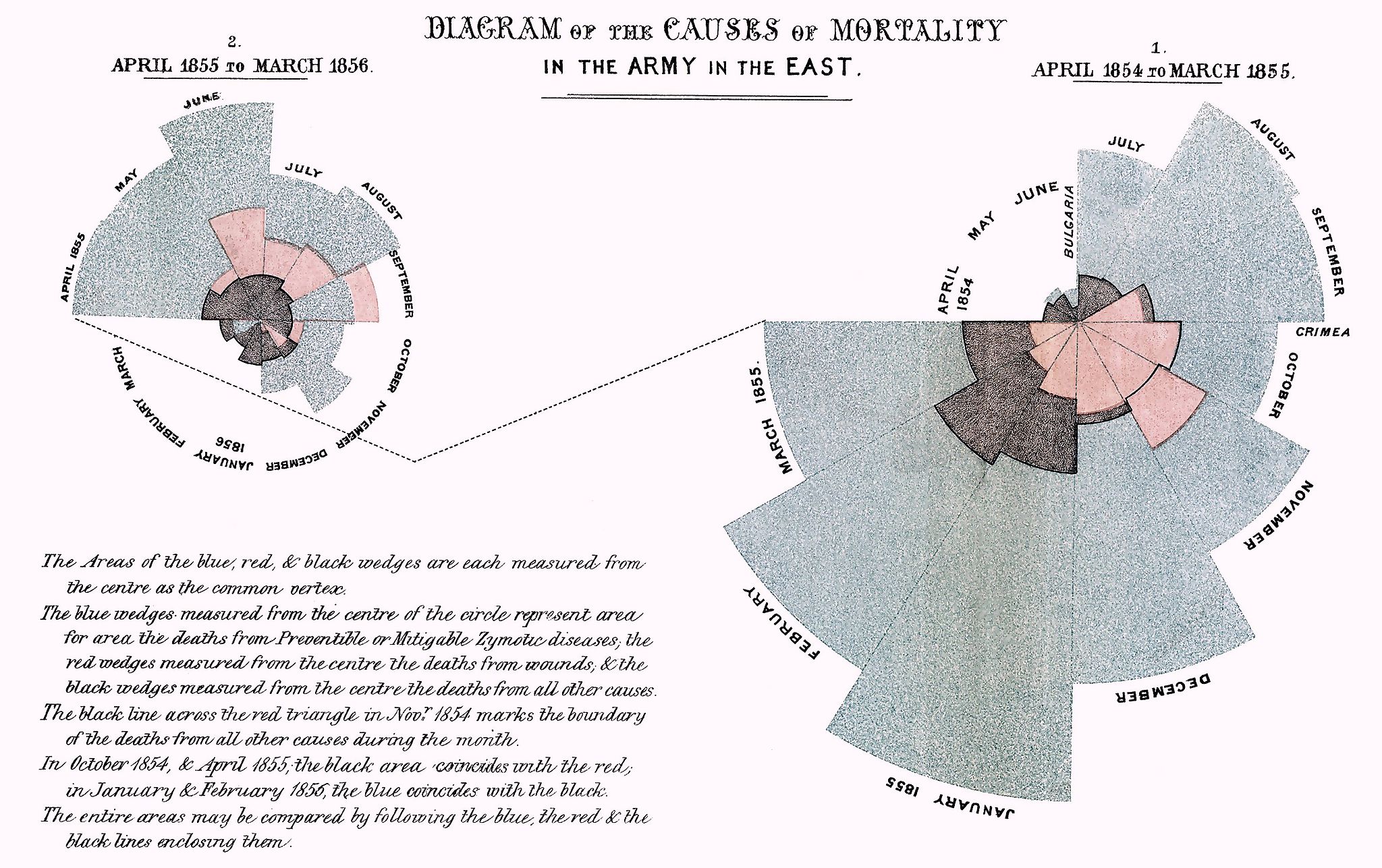
Social media has popularised the infographic, but the reality is they are not new. Analysts have been creating maps, charts and other visuals to communicate narratives within data for centuries. Florence Nightingale’s famous ‘Diagram of the causes of mortality in the army in the East’ (above) was one such example.
This diagram visually described how mortality from preventable disease was greater than that of wounds and other causes. We know these now as Polar Diagrams.
What can we can learn from Florence Nightingale’s experience?
When we consider visualising data of our own, the starting point must always be our data. The quality and rigour of that data is what gives the work we do authority and authenticity. If you don’t have analytical skills of your own make sure you have a data analyst on your team when developing an infographic.
- Always start with the data
- Talk to analysts to get the most from the data
- Do not cheat the data
Understanding your audience is critical to the success of a data visualisation. Knowledge of your audience will help you to identify the messages and narratives within the data that will most effectively resonate with them.
Your understanding of an audience will help you determine the scope of your visualisation, the detail and the complexity. Put simply, your understanding of your audience will determine if your visualisation will be understood.
- Have people on your team who understand your audience
- Find a narrative in the data
- Test your ideas before publishing more widely
With public health data there are always stories to tell.
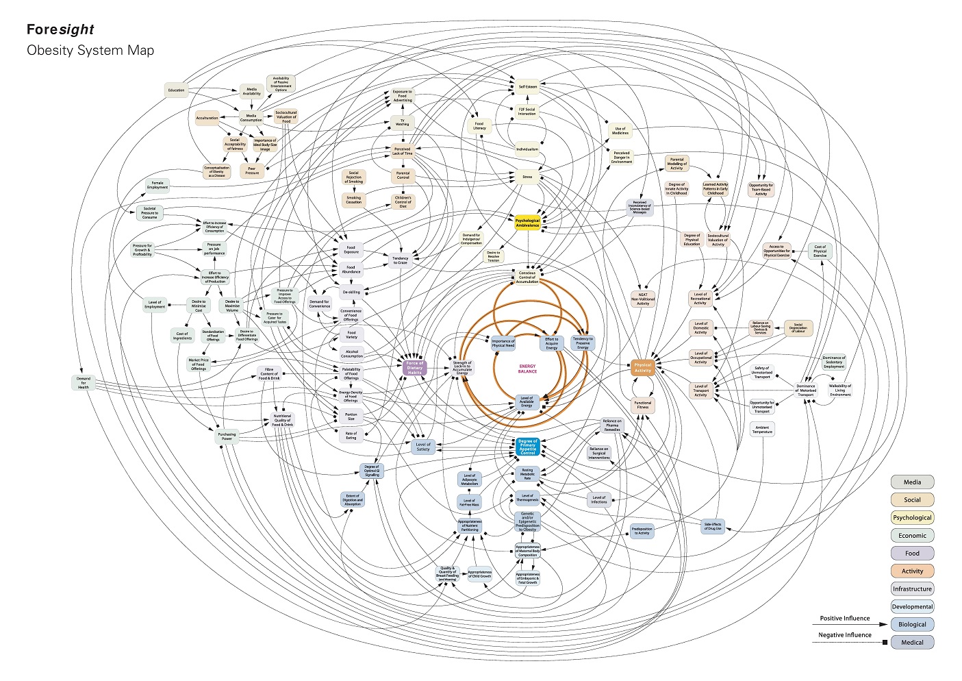
The ‘Foresight Obesity System Map’ attempts to chart the many determinants of obesity. It is often referred to as the ‘Spaghetti diagram’ such is its appearance. This in itself is a narrative of the obesity issue, it is complex and that message is conveyed visually before we event start to process the information within.

With data and a narrative we need to turn back to our audience to consider how best to reach them, what form is our visualisation going to take? The overall aesthetic of an infographic is what grabs attention.
Florence Nightingale produced many polar diagrams as she believed her audience would more easily understand the issue expressed as a chart than that of a report and therefore it became a more powerful document.
Communicate don’t decorate
There is a temptation to find metaphors to explain large numbers, we find ourselves measuring using length of football pitches, numbers of double decker buses and of course the size of blue whales.
This type of illustration does not help to convey the narrative of the data but can instead confuse the viewer. When you need to describe a large numbers, like a million, the most clear description is quite often a million.
- Check the copyright for imagery you use
- Communicate with design not decorate
- Use scales people can understand
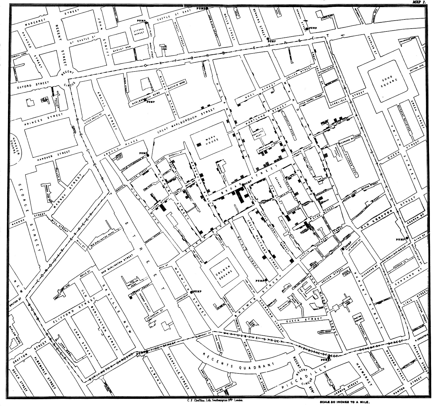
The presenting of data in different formats can help to tell a different story even though it uses the same information. For example, a list of addresses may reveal little about a population, but when John Snow plotted these addresses for cases of cholera on a map of Soho he was able to identify the source was the Broad Street pump and in turn prevent further incidents.

When thinking about design and your chart of choice, work with analysts to make sure that the design is working with the data and not in the way of it. If you don’t have the graphic skills to create the standard of work you require then make sure that somebody on your team does.
Good infographics take time
At this point we must again reflect on the polar diagram of Florence Nightingale. We can look on the simplicity of the visual and forget the volume of data collection, analysis and interpretation required to underpin this infographic but also the time and care taken to produce the final work.
In an era before computers each of those arcs will have been calculated on paper and drawn out with a compass, ruler and protractor. Creating high quality infographics takes time and care at every stage of their production and requires input and expertise from a range of professionals.

1 comment
Comment by Professor Paul Stanton posted on
Historically, NHS professionals have used 'data obscurity' as a source of power. Intelligent infographics have the potential to 'democratise' data - rendering it's key messages accessible to people who may not be data literate. "Data democratisation' demands courage - but as The Martian reminds us “You know, sometimes all you need is 20 seconds of insane courage. .... And I promise you, something great will come of it.”