

This blog accompanies the official release of the Public Health Dashboard and is intended to serve as an introduction to the tool.
What is the Public Health Dashboard?
The purpose of the Public Health Dashboard (PHD) is to support local decision-making by bringing existing comparative data into one place and making it accessible and meaningful to a wide audience.
The data
The PHD contains data on public health service areas that local authorities lead. These include mandated functions. The majority of data included in the PHD is already in the public domain, but by summarising the data the dashboard will help stakeholders understand how local authorities compare to one another. The PHD provides a summary of data in seven service areas:
- Best start in life
- Child obesity
- Drug treatment
- Alcohol treatment
- NHS Health Checks
- Sexual health services
- Tobacco control
Alongside these is a single headline indicator on air quality.
For each of the seven areas a composite summary rank is calculated by combining a number of component indicators (this is not necessary for air quality as it is a stand-alone headline indicator). Each local authority has then been given a ranking that describes how local delivery compares with all other local authorities. They can be shown in relation to their nearest statistical neighbours, as defined by the Chartered Institute of Public Finance and Accountancy (CIPFA, 2018), by deprivation decile, or for England as a whole.
For more details about the methodology used to calculate the summary rank indicators please click here.
How to use the tool and interpret results
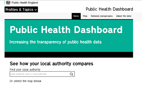
Finding your area of interest
From the dashboard’s homepage, the user can search for the local authority they’re interested in, either via the text search box or by selecting the area on the map. This takes the user through to a page which allows comparison of their selected local authority against similar local authorities, based on CIPFA (the default view) or deprivation group, or comparison against all local authorities in England. These comparisons can be made separately for each of the summary indicators within the PHD.
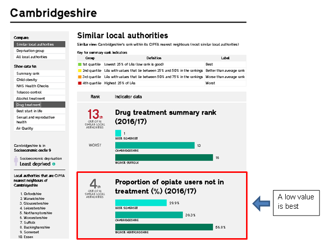
By selecting the local authority of interest (in this instance Cambridgeshire), a page detailing the summary rank information for that local authority is displayed. Within the PHD each local authority is ranked for each service area. A rank of 1 is the best, whereas a rank of 152 is the worst. These ranks are then split into quartiles, where the 1st quartile is “best”, the 2nd is “better than average”, the 3rd is “worse than average” and the 4th quartile is “worst”. The page displays a bar chart for each summary rank indicator, showing the best and worst ranked local authority for the comparison group along with the position of the local authority of interest.

Summary ranks and component indicators, what do they mean?
Compared to similar local authorities (as defined by CIPFA nearest neighbour methodology), Cambridgeshire is ranked 2nd for child obesity, but 13th for drug treatment. Comparing Cambridgeshire with local authorities with similar overall levels of deprivation reveals a similar picture (ranked 1st and 12th for child obesity and drug treatment respectively), while for the whole country, Cambridgeshire is ranked 10th for child obesity and 125th for drug treatment (these can be viewed by selecting the different options in box 1).
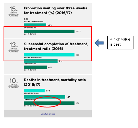
Looking at this, a user might want to explore what is driving the drug treatment summary rank for Cambridgeshire. They can do this by selecting drug treatment from box 2. This provides details of the indicators that are included in the drug treatment summary rank, as well as the rank position of each of these component indicators. In this case, there are 4 indicators that are combined into a single summary rank (the number of component indicators varies by service: each composite indicator is calculated using between 2 and 5 component indicators).
This page also includes bar charts for each of the component indicators. The bar charts give an overview of the local authorities doing better or worse for each indicator, as well as presenting values and showing whether a high or a low value is good for a particular indicator. For example, a low value is good for the proportion of opiate users not in treatment whereas a high value is good for the successful completion of treatment.
Exploring the data
From this, we can see where our local authority of choice is doing well on some of the indicators and not so well on others. Commissioners looking to improve the drug treatment provision in their area could examine these indicators to start with and combine it with their knowledge of the local context surrounding this service area.
To allow users to get a wider perspective, it is also possible to view a table showing the rankings of the similar local authorities (as opposed to seeing only the local authority of interest’s rank among them). This can be accessed by clicking the “View Full Rankings” link at the bottom of the comparisons page. Using the example of Plymouth and sexual and reproductive health, by clicking the link and selecting the relevant indicators on the left hand side, we can easily see how, for example, the chlamydia detection rate in Plymouth compares with their “nearest neighbours”.
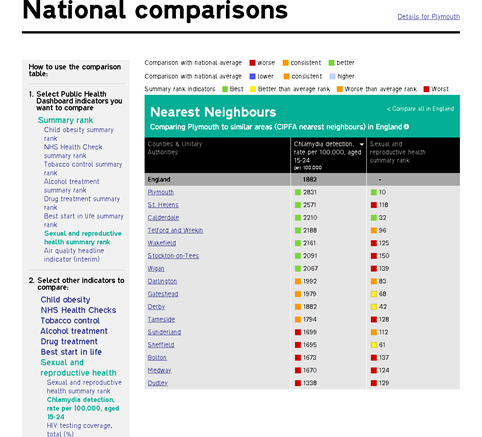
It is also possible to view this table looking at local authorities of similar overall levels of deprivation or for all local authorities in England.
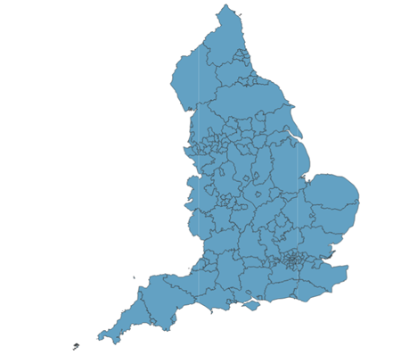
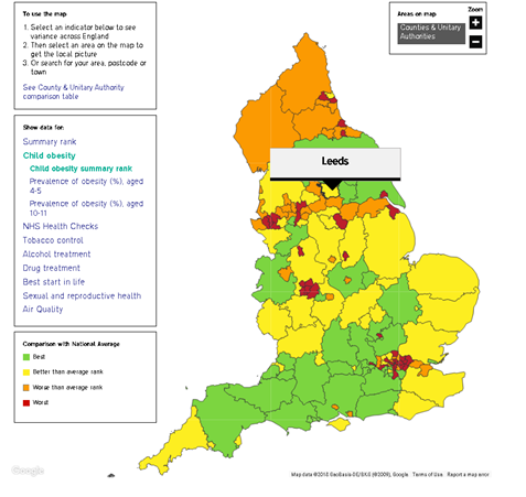
Another way to view the data
The data in the PHD can also be displayed in a map view. This can be done by selecting the “Map” tab at the top of the dashboard webpage. Similarly to the comparisons pages, the indicator of interest is selected from the box on the left hand side. This can be the summary rank indicator or can be one of the component indicators. In the example shown, the child obesity summary rank has been chosen and we can see that, for example, Leeds is coloured yellow – signifying that it is in the 2nd, or better than average, quartile as compared to the national average. This display is useful as it provides a more visual comparison of different areas.
The dashboard is designed to prompt further investigation about how local delivery compares and is supported by the in-depth information that is contained within Local Authority (LA) Health Profiles, PHOF and other profiles on PHE’s Fingertips.
For more information about the tool, please click on the “About the data” link located within the tool at the top of each page, or contact the team at phdashboard@phe.gov.uk.