

We’ve recently launched a refreshed dashboard design with some exciting new features.
The changes are in direct response to a survey of tens of thousands of our users. There was a lot of feedback, with one response running to more than 30,000 words!
But the main message was that people’s needs from the dashboard have changed as the pandemic has evolved. In the past you mostly wanted to know the totals, the numbers of cases and deaths since the pandemic began.
Now there is a far greater demand for the latest trends. So, with different local restrictions coming into force across the country, we wanted to give people the ability to understand the situation in their own areas in as much detail as possible.
So what have we changed, and why?
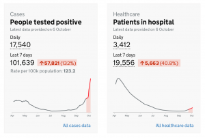
Introducing trend information
On the homepage the focus is now shifting away from total figures to a rolling view with recent figures and current trend information. Users can now easily see the figures for the last seven days compared to the previous week. We hope this will give people a much clearer idea of the direction various metrics are heading, and at what rate.
Increasing the amount and ease of finding local information
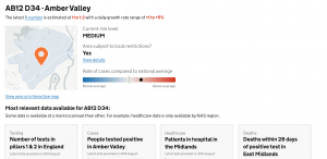
Another area we’ve been spending a lot of time on is improving the ability to find out local information and insights.
On the homepage you can now enter a postcode and receive a summary view for all the key metrics, with the most detailed level of data for your area.
We’ll also be adding more information to this page in the future to help users assess the risk level for an area, and to highlight any local restrictions that may be in force.
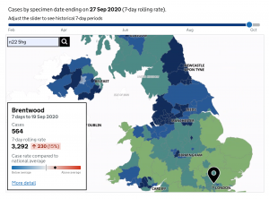
Maps make a comeback
Linked from the homepage our new map allows people to zoom into local areas to receive increasingly granular information.
By default, users are presented with the last available seven days of data. But by using a slider, it’s also possible to go back in time and observe how the pandemic shifted across the country.
And if you click on different areas of the map you can see information relevant to that region, local authority, or even smaller. This includes the 7-day total of cases or deaths, and the 7-day rolling rate. An indicator highlights how the selected area compares to the national average.
We’ve also made a few other changes to the dashboard to help make the page more accessible, including the linking to easy read documents from the homepage.
As always, please send us any feedback to coronavirus-tracker@phe.gov.uk - we’d love to hear any thoughts and suggestions for how we can continue to improve the dashboard.
You can also find out more about the COVID-19 dashboard in this blog.
10 comments
Comment by Helen Ardani posted on
New Dashboard is clear and informative, very well done , you can see clearly the cases in your area and it is easy to follow
Comment by Ian Thompson posted on
It would be good for morale to see the number of patients recovered
Comment by B. Peel posted on
The basic actions that the goverment have given, keep a distance, wash hands well and often, and wear a mask as necessary. These would control the spread of this infection if everyone adhered to them. I was in lockdown for 12 weeks, since I have been going out again I have been in shops and resteraunts where I have felt completely safe. Alas not everywhere.
Comment by Dianne Chrystal posted on
Take out the university student numbers and give us the general population as these numbers are massive in university towns inflating the situation what happens when they all go homecat xmas
Comment by Craig Feenan posted on
No shielding risk?
Comment by Shauna posted on
How much is this costing?
Comment by Kevin Quinn posted on
How about hospital admissions etc broken down by NHS trust daily.
Comment by Mick posted on
The colour code for the interactive map needs to be changed. The ceiling is far too low. MSOAs with 400 cases /100k are the same colour as MSOAs with several thousand cases /100k, requiring endless mouse clicking in order to distinguish problem areas from scorching hot areas. Same problem existed with the arcGIS app.
Comment by Paul Brackley posted on
Please reinstate the XLSX spreadsheet under About the Data - was very helpful.
Comment by Tracy Gould posted on
Hospital admissions is the most important data, as lockdown is based on how the nhs is coping with pandemic. As hospital admissions drop we can see if the lockdown is working and which areas will continue to be restricted. So please reinstate this data?