

When we first started the COVID-19 Dashboard back in March 2020, it was just a map and a few charts reporting four metrics on cases and deaths.
How that has changed in a year. We are now publishing nearly 200 metrics at 4pm each day – which adds up to about 40 million individual figures – as hundreds of thousands of users across the country refresh their browsers in anticipation.
Alongside the London Stock Exchange, the value of the pound and the weather forecast, PHE’s COVID dashboard is the most important and reliable daily statistical publication in the UK.
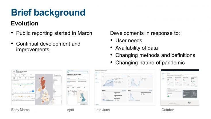
In the early stages of the pandemic, we did much of the work manually. For what felt like a very long time indeed, it was just three of us.
But with the sheer volume of data involved now, we have grown into a team of 18 and built a (largely) automated data pipeline that can handle all the different formats and reporting schedules.
Sadly, that doesn’t mean the pressure is off. Delays or changes to any one of the datasets at any stage can potentially set back the whole UK daily update.
The daily publication schedule is unrelenting, and the pressure is high. But what has kept us going through nights, weekends, holidays and three lockdowns has been our close relationship with the dashboard’s users.
Each week there are about 19 million page views across the site, many of them postcode searches on the interactive map. That’s more than any page on the Government’s GOV.UK portal since it was created.
During the peak of the third lockdown there were a record 76.5 million hits in just 24 hours.
We are proud that the latest data are always available to members of the public at the same time they are seen in Downing Street.
And we’ve been constantly adding new features to make it easier for people to understand the data most relevant to their communities, and to the policies that affect their lives, in response to user feedback.
We’ve also been working with individuals and groups who may have greater difficulty using the site to make it as accessible as possible, including providing easy-read formats, enabling screen readers, and building appropriate colour palettes.
All the data we use (and more) are available for download, and for professional users we have built a suite of Application Programming Interfaces (APIs) to make the data as open and reusable as possible.
This seems to be paying off. Tens of thousands of people have contributed to dashboard surveys over the last six months.
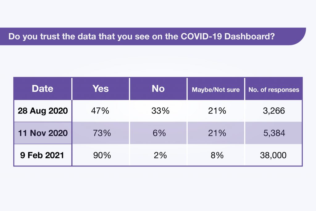
Results from our most recent survey showed an outstandingly high level of user trust in the dashboard data at 90.3%, up from an already high level in November when 73.4% of users responded that they trusted the data. But it’s a remarkable turnaround since the summer, when less than half said they had confidence in the statistics they were seeing.
Do you trust the data that you see on the COVID-19 Dashboard?
We already know what our users say they like the most (they are most interested in data about vaccinations and cases and now less interested in deaths and testing). And we know what they don’t like - delays, changing definitions and big corrections – all of which we try hard to avoid.
The team are trying to get an even better understanding of this feedback by using novel techniques such as text classification and clustering to pick out key themes from free text comments so we can make sure they are factored into our design process too.
The dashboard has been a major contribution to transparency in the government’s approach to the pandemic, and we know from our surveys it has become an essential public good for many.
So, as long as the data are needed, we will keep publishing every day – and keep listening to our users to inform further expansion and improvement.
44 comments
Comment by William Avery posted on
Excellent, reliable and honest data. Many thanks, please don't make any major changes
Certainly don't remove any aspect.
Comment by Christophe Fernandez posted on
This is a world-first, congrtatulations.
Your approach cultivates data numeracy and deployment across many audiences: good for C19V containments and recovery both health and economy.
It's great thanks. CF 22 March 2021
Comment by Mary Woods posted on
You have been doing a great job!
Comment by MICHAEL CROSSLAND posted on
I look at the dashboard every day and find it very informative, I'm 100% trusting of the figures and have built my own spreadsheet of graphs and figures using the data provided on your daily dashboard.
One thing I think may be useful at the top of the Vaccinations page is to show the percentage of the adult population vaccinated with first and second doses, I know the data is available by drilling down in this page but a percentage would be good on the front page.
Comment by Jenny Sykes posted on
Love the dashboard and a huge thank you to all involved. Would it be possible to include the daily increase in first and second vaccinations in addition to the actual numbers of daily vaccinations. That would be very useful. Thank you.
Comment by Peter clark posted on
In general I am very happy with the site and its contents.
I appreciate that the updates are dependent on figures being provided by people who are probably engaged in other important work.
The site is important to give anyone interested a good feeling for how the virus is being beaten back.
I stopped recording the tests to date after 2 weeks of unexplained discrepancies (of tens of thousands per day) between yesterdays total to date, todays totals and today's totals to date.
I try to monitor the test positivity rate but it is not easy to see which amount of tests have produced which amount of positive results, though I suspect the Welsh positives relate to the previous days tests.
The reporting of numbers of cases without reference to the positivity rate can be very misleading - perhaps users could be reminded of this.
The weekday tests seem to have increased which I assume is related tom the testing of English schoolchildren - it would be useful to have these tests and corresponding positive results reported separately to save muddying the water either way.
Thank you all, and keep up the good work.
Comment by SG posted on
Thank you for all your work - I find it fascinating looking at it each day. The graphs have helped explain to my primary school aged son why there are major changes happening to his life so that life seems less unpredictable to him.
I'd rather this comment wasn't published just wanted to say thank you for your efforts.
Comment by Chris Hooper posted on
It's bizarre that I actually look forward to the 16:00 daily update
Comment by James posted on
It's become a daily ritual for me too
Comment by John Aspel posted on
As I see it all agencies of the Government have done a great job. It is easy to criticise and too many people are carping about minutia and far too many still not following the rules. They need to look at the mess in the EU.
Well done all.
Comment by James G posted on
Hear, hear!
Comment by Olwen Poulter posted on
Thank you so much for your efforts. Before my retirement I was a data monkey so I know how much work is involved. It is my set point every day, kettle on at 16.00, but don't look until 16.10 just in case it's late today.
Comment by Kate Conde posted on
Fantastic work on the dashboard. I use it every day. Well done and thank you.
Comment by Kay Whitney posted on
I'm now more interested in the data on deaths and the number of hospital admissions along with vaccnaction roll out. Due to the phenomenal success of the vaccination roll out it's admissions and deaths rather than case number I feel are most important.
Comment by Nicola Santamaria posted on
Thank you for this vital work. Misinformation can lead to all kinds of difficulties, so it is really good that you are supplying us with accurate figures and that you give us an explanation for delays when they occur.
Comment by Maria posted on
Thank you so much to the team who are working so hard on this dashboard. Every day I check and see that vaccination numbers have increased it gives me a feeling of hope. I'm sure millions of others can say the same.
Comment by Jenny posted on
You have been doing an incredible job. And lots of valuable lessons to be learnt for anyone who works with statistics and data and the public. Thank you
Comment by Howard hiscutt posted on
fantastic work!!!! so good to have an easy to understand picture of the situation.I,m on it every afternoon.your dedication is much appreciated.
Comment by Marie posted on
Thank you for doing such a great job
Comment by Erhard Keller posted on
yes the dashboard is good, thank you
what is missing is a timeline of the percentage of positive tests in relationship of tests completed. That says more about infection than the actual number that you publish, because the number of tests has increased and varies sometimes.
Doe you include lateral flow tests?
Comment by Joy Townhill posted on
Thank you for all your team do to give us the best news you can.
Comment by Anne East posted on
Thank you for all your hard work. I really appreciate being able to keep up to date with the data. Just one problem, the interactive map is very unstable when viewed on the Safari browser, it usually crashes as soon as I try to zoom in to an area. I have more or less given up with it, which is a shame.
Comment by Paul posted on
No No. I am interested in the "daily" cases/tests/hospital admissions and where the infections are happening. Your information is fairly in the same format, so easier to follow what's happening.
Your not fully "black and white" data, but you are the best there is for normal people.
Thank you, and please keep it simple and the same.
Comment by Mark Snowden posted on
Very impressive, and helpful dashboard.
Is there age breakdowns for
'Numbers hospital'
'Hospital admitances'
'Deaths'
Comment by Chris Girdler posted on
Brilliant to know what is going on behind the scenes. Not sure how other countries report their data, but for me as a journalist virus dashboard is an absolute go to site every day
Comment by Gillian Turner posted on
Thank you for all the work you have done - it’s one of the aspects of the UK Covid response of which we can be most proud.
Comment by Iain Low posted on
It is a high quality offering and you should be proud of it. Stability and predictability has a quality all of its own.
However,
The R factor is complete bunkum. You can’t have that level of uncertainty in both numerator and denominator. That’s why you issue it with such a level of uncertainty around it (currently +/- 15%).
Comment by DLG posted on
People may be "most interested in data about vaccinations and cases and now less interested in deaths and testing", but please don't stop showing the daily deaths and testing figures. Tragically, the only figure that ultimately counts, after all, is the deaths.
Comment by Alan Pritt posted on
You've done an excellent job. Thank you for your hard work over the year.
Comment by Kathleen Gardner posted on
Well done you folks...top work!
Comment by Alan Hooley posted on
I look at the dashboard every day and search for data about the places my family (Brothers, sisters, sons amd daughters) live and they are as diverse as can be with some in Edinburgh and others in Teesside, Wigan, Liverpool, Portsmouth and Weymouth!
It allows us to discuss the pandemic, as it affects us as a family, in terms of the past, present and hopefully the future, so thank you for your efforts. The
Dashboard is incredibly important to us. Everyone knows that suffering in the dark is the hardest way to suffer. The dashboard helps us to see the light coming towards us. Thank you again.
Comment by Harry posted on
Great work, thanks!
Comment by John Munson posted on
Amazed what you've achieved with so small a team. I have really appreciated having access to this data.
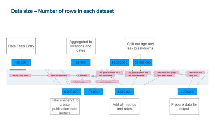
I notice the 'data size' illustration above mentions age and sex data. It has recently occurred to me that some basic analysis of case rates by age would be useful addition to the Cases page in the dashboard - if you have time and resources to do it. Also perhaps rates for those who've been vaccinated for over three weeks and those not yet vaccinated.
Comment by Eve Barr posted on
You are doing a fantastic job keeping us informed.
Comment by Simone posted on
Many thanks for your hard work. Well done. Thumbs up. Your dashboard is marvellous.
I'm interested in all data and compare them, because this allows me to see the context. Especially, the look into the history is important like the context of rising figures from Kent across the country, and its impact on the hospitalisations.
That I'm able to see even my local hospital figures is truly remarkable.
If all countries had such good dashboard, there were less misunderstandings about the impact of Coronavirus.
Please leave that dashboard available for all the years to come. Scientists and people like me will need that for their analyses.
I have only one question: Is it possible to show the curves for tests, cases, hospitalisations, deaths and vaccination in one chart? Due to the different Y numbers (tests with hundreds of thousands, but deaths have 2.000 a day), I can't get the screenshots of the charts on top of each other.
Having such chart would make it even more clear why we have to act before the figures in the hospitals rise.
Comment by Michael Wensley posted on
Very insightful post, thanks for sharing. It’s interesting to see the progression from inception to present day.
Comment by Rob posted on
Keep up the great work team. Your work is very much appreciated
Comment by Samantha Motherwell posted on
Thank you, I check data in my postcode every few days to see statistics in my area . It’s very helpful
Comment by Timothy Horgan posted on
Give the heads up on cancer cases far far more serious than a flu
Comment by Sonja Weigl posted on
Well done to the team who are behind the COVID-19 dashboard, it is a fantastic tool to use and really impressive to see the scale of the daily dataflows, and the hard work that has gone into it's development over the past year!
Comment by R Schofield posted on
Have kept the figures since day 1. found them very interesting .It would be goodto have a percentage or positive results against total tests which shows the trend of infections. This is more informative than bare positive results. I currently calculate this.
Comment by Jan posted on
I can only echo R Schofield requesting the percentage positive test rate for any given day, please.
Comment by P. Elisha posted on
Hi. Each day waiting for the results for Surrey and the the IOW to do a cross check ( Surrey, Waverley, IOW ) on the positives this covers approx 1.3 persons, from this I can see the direction up down or holding.
This comparing week on week but giving a daily result.
Just had my second Jab via my mobile at Guildford a great service.
Comment by Lisa Miles posted on
The Dashboard is unrecognisable from the start, and I have extracted from then. So well done for that.
Please, please can we have the cases by location? (ie hospital, prison, school, community etc). People worried in one area and it turns out to be a prison outbreak. The data is not complete without this. A lot of cases are caught in hospital and this should be shown.
Ages of the positive cases and as others have said, the split between lateral flow and PCR.
The percentage +ve to test is so easy to do on my spreadsheet but it would be good to see this for those that don't collect the data every day.